CONFLICT URBANISM COLOMBIA
Visit the Conflict Urbanism Colombia website Read Visualizing Conflict: Possibilities for Urban Research Read A Gravity Model Analysis Of Forced Displacement In ColombiaConflict Urbanism Colombia is a collaboration between the Center for Spatial Research and the Maters in Peace Building at the Universidad de Los Andes. Its team included Laura Kurgan, Juan Francisco Saldarriaga, Angelika Rettberg, Dare Brawley, Mike Howard, Jeevan Farias, Stella Ioannidou, Patrick Li, Anjali Singhvi, Jonathan Izen, and Hu Yuan.
Over the course of the last thirty years, almost seven million Colombians have been forced to leave their homes and towns and move to safer locations. Thousands more have been victims of sexual violence, threats, land-mine explosions, homicides and massacres. Conflict Urbanism: Colombia maps and visualizes these crimes in hopes of better understanding the patterns and ramifications of the Colombian conflict.
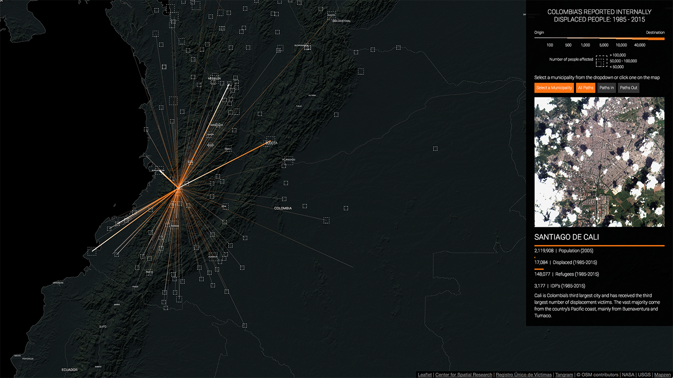
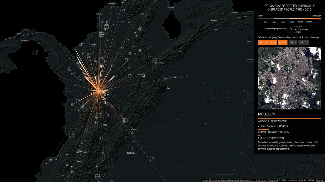
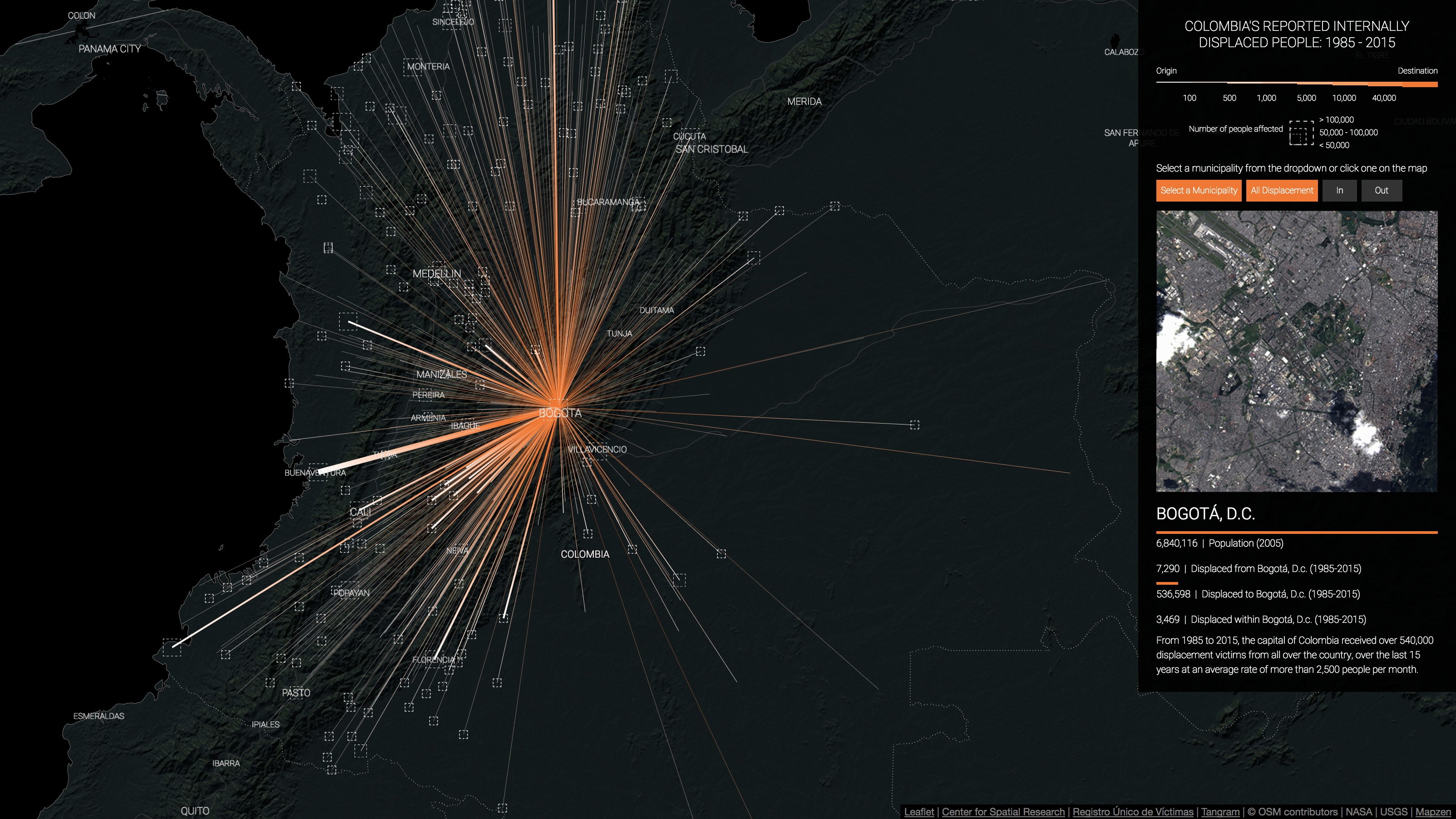
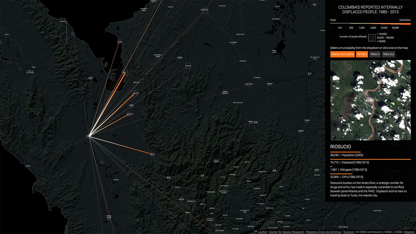
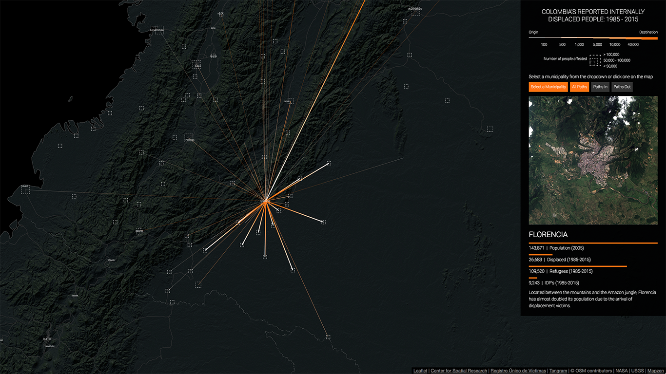
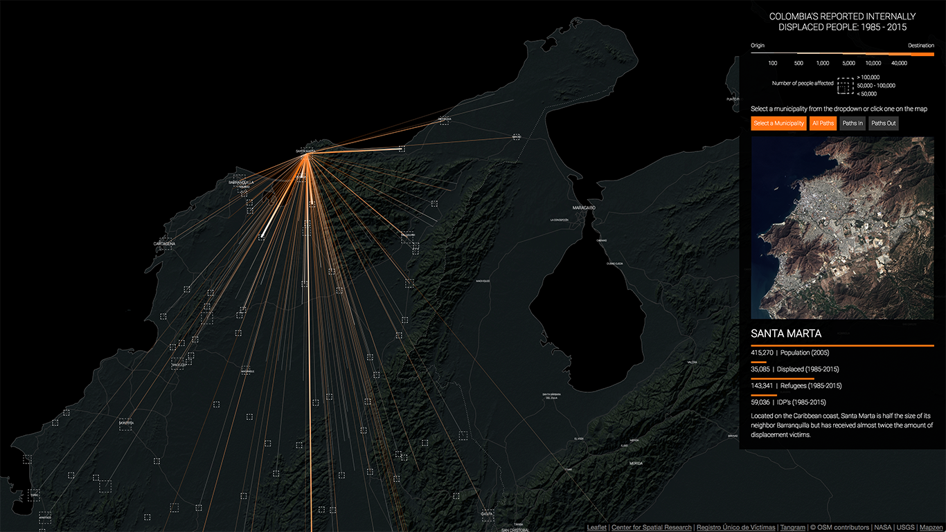
Our interactive map shows the paths of internally displaced people from 1985 to 2015. The thickness of the lines represents the number of people that were displaced, from 100 to 40,0000, and the colors represent the direction of the displacement, white is the origin and orange the destination.
You can click on some of the municipalities to see only the displacements to and from that location and to bring up a side panel with more information. This panel contains a satellite image of the selected municipality (courtesy of NASA Goddard Space Flight Center and U.S. Geological Survey), the latest population data from the Colombian National Department of Statistics (DANE), the total number of displaced people from that municipality, the total number of displaced people that arrived to that location, and the total number of people that were displaced within that municipality.
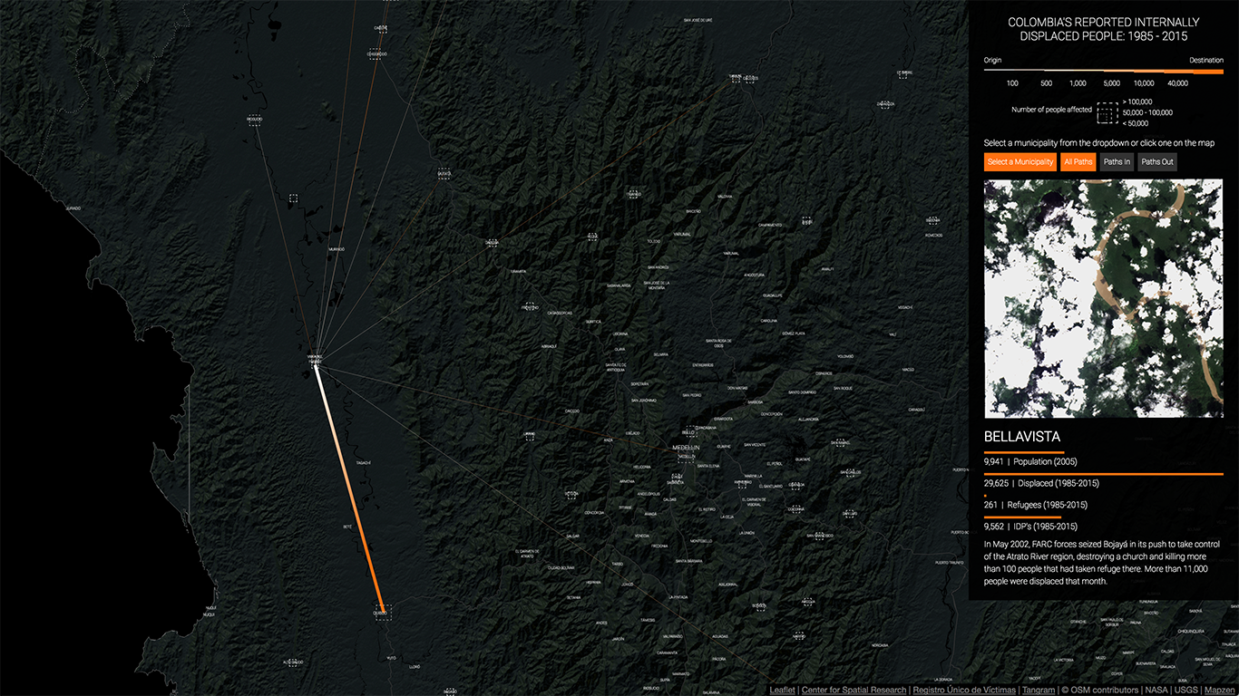
Some of the interesting things you can see in the map are, for example, the large number of displaced people that moved from small towns to large cities like Bogotá, Medellín, or Cali. Or the large displacements that occurred around the most infamous massacres of the the conflict: for example, the attack on Bojayá by the FARC, the taking of Riosucio by the paramilitaries - aided by the Colombian army - or the current wave of displacement taking place in and around Buenaventura.
The map also highlights other aspects of the conflict that are not that well known or understood: it makes clear that municipalities like Florencia, Popayán or Pasto in the southwest also received massive amounts of displaced people, and that all the main cities along the Atlantic coast, Cartagena, Barranquilla, Santa Marta and Riohacha, have been destinations for scores of displaced people.
Overall, what the map really reveals is how the conflict has enveloped the whole country in a deep and intricate web of displacement and violence. More than the individual displacements that have occurred from the country side to the cities or within small and medium-sized municipalities, this kind of visualization provides a way of grasping the intricacies and complexity of the war.
Our site also includes a video animation which shows the displacement of people from 1985 to 2015. However, to visualize the temporal as well as the spatial dimensions of the conflict we use a simple particle system that animates every single displacement in the dataset. The advantages of showing this information in video form are that it allows us to display a rather complex dataset in a single diagram while still conveying a sense of dynamism that a static graph cannot produce.
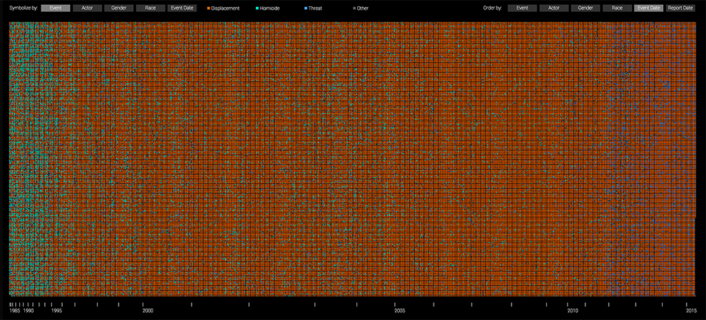
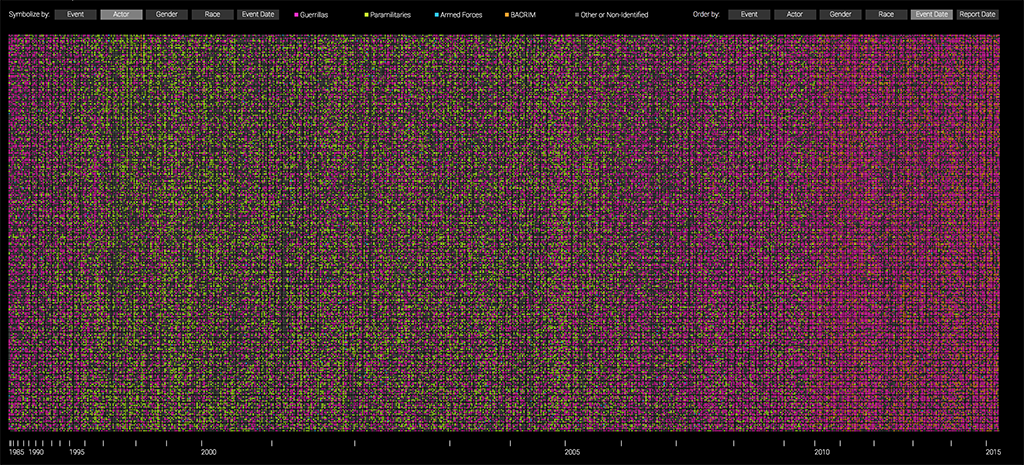
Another way in which we visualized the Colombian conflict was by creating an interactive visualization of 200,000 randomly selected victims, each represented as a pixel and sorted and color-coded based on different attributes. By maintaining the granularity of the dataset and looking at it victim by victim certain known patterns are clearly revealed and other, not as apparent in the data, become evident.
For example, in the image below the victims are sorted (left to right) by the date in which the victimizing event occurred and color-coded by the type of event. Here we can see how most massacres and homicides (in teal) occurred between 1985 and 1997, while the bulk of the displacements (in orange) happened after that. We can also see how, starting in 2012, the number of threats (in blue) has grown dramatically.
If, instead, we color-code the pixels by the group that committed the crimes and maintain the order, we can see how the paramilitary groups (in green) were most active between 1995 and 2006, which coincides with their official demobilization date. Similarly, we can see how after 2010 the number of victims from “Other” groups (in gray) has increased dramatically. This “Other” group includes the new small criminal bands (BACRIM in Spanish) which emerged from some of the demobilized paramilitary groups.
Finally, if we instead sort the pixels by the date in which the report of the crime was filed and color-code them by the type of crime, three striking patterns emerge from the data: one, it is clear that from mid 2008 to mid 2010 there was a concerted effort to collect reports on homicides and massacres (in teal); two, from mid 2010 to 2012 the reports that were collected were almost exclusively about displacement (in orange); and, three, starting in 2012, there seems to be more variation in the types of crimes that were reported.
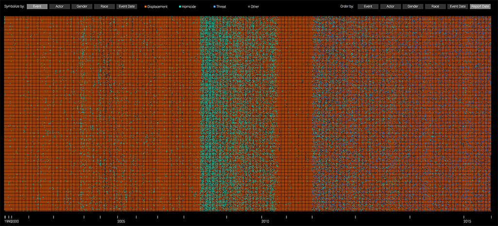
These patterns reveal more about the collection process than about the actual crimes that were committed, and as such, tell us something about how the data was gathered by the government. This, in turn, should help us question the dataset itself and treat it with the necessary skepticism and care. For example, why was there such a clear effort to collect data about massacres between 2008 and 2010? And why did this focus switch to collecting reports about displacement? We suspect this has much more to do with the political realities at the time than with the conditions on the ground. Ultimately, however, this does not mean that the data itself is false but only that it is the product of a specific collection effort and thus, might not capture the whole reality of the conflict.
Conflict Urbanism Colombia was built with Tangram, Leaflet, D3.js, Three.js, Processing, Photoshop, Landsat-Util, and After Effects.